UX Design
Artist Bio App
Project Overview
The Problem: Art galleries need an easy way to provide information about the artists whose work they choose to display in their exhibits
The Goal: Design an app that will allow for the easy consumption of information about the artists being displayed in an exhibit, or in past exhibits
The Product: An app to display artist biographies for an art gallery
My Contributions
I was the primary UX researcher and designer on this project, which was completed for the Google UX Design Professional Certificate.
The final design for the Artist Bio App can be tested here.

Persona: Jackson
Age: 19
Education: In college
Hometown: Boston, MA
Family: Single, shares dorm
Occupation: Student
"I want my school projects to provide the most in-depth research I can get about an artist, so I can get an idea of what their background is."
Goals
• To gather information about an artist's background and thought process while they made a piece or collection
Frustrations
• Not getting more than a small blurb of info about the piece or the artist that made it
• Needs a way to save what they've observed when they can't take pictures of the art
Jackson is a college student studying Art Therapy. As part of their assignments, they attend art galleries and survey the work. Their goals are to get the most information about an artist that they can, and sometimes it can be difficult to find what they need at the gallery.
The Artist Bio App was a project I completed while studying the first five courses in Google's UX Design Professional Certificate. In the beginning of those courses, I learned about empathizing with users and their pain points, creating personas and user journeys, and performing research such as competitive audits and interviewing candidates for testing.
Then I was able to synthesize those results into guides that would form the basis of the app's design, learning about some techniques for ideation and how to create wireframes both on paper and digitally.
 |
|---|
 |
Affinity Diagram
 |
|---|
 |
 |
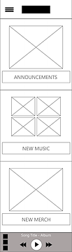
Paper Wireframes
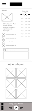
High-Fidelity Mockups
I became familiar with both Adobe XD and Figma in terms of prototyping, but ultimately decided to work in Figma for this project. After creating a working low-fidelity prototype of the product, I had candidates participate in usability testing of the lo-fi prototype and took notes regarding their impressions and interactions with the design.
I was able to use the information gathered from the various studies to improve on my designs before finalizing them with a high-fidelity prototype. I asked some of the same participants and some new faces to test the product once again, and after another round of studies I was able to finalize the high-fidelity prototype to the point where it would be well enough to be shared with a team for engineering.
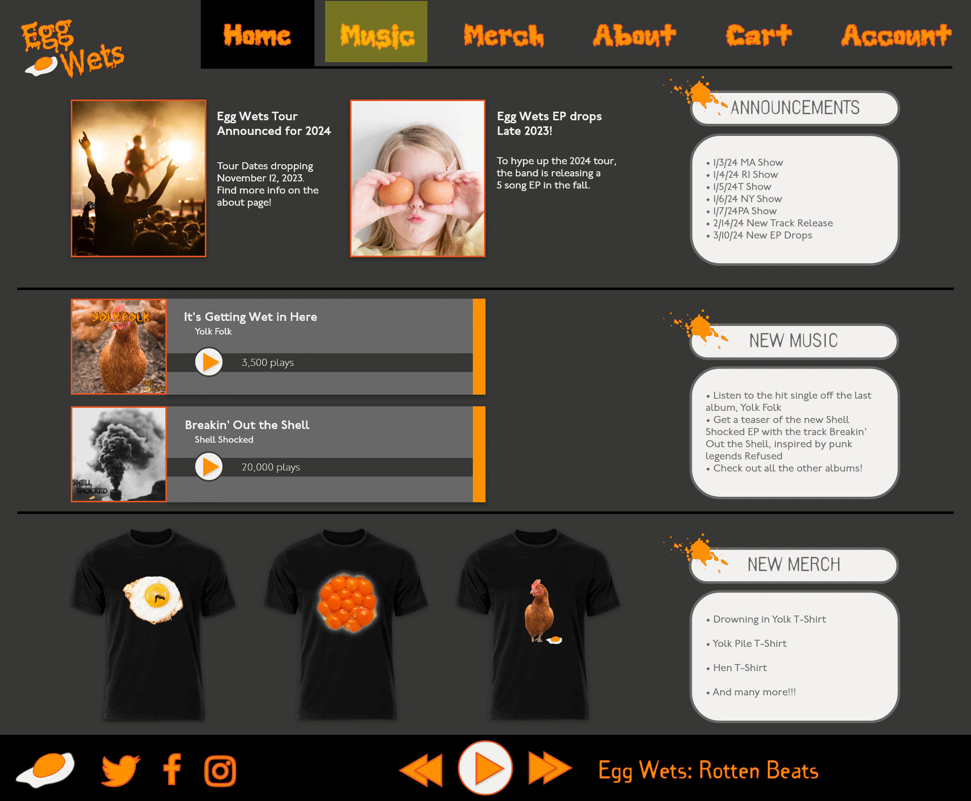
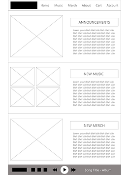
Below are the mockups after one round of usability studies and the finalized versions of them underneath.


Takeaways
Impact
The app allows users to further engage with artworks and learn context about the artists that are presented in a gallery, without the distractions of social media.
One quote from peer feedback:
"I totally love and appreciate it; sometimes it's nice just being able to individually appreciate some kind of artwork and not feel like I have to comment."
What I learned
While designing the Artist Bio App, I learned that every person engages and responds to a design in their own individual way, and the resulting usability studies really influenced the final outcome and user flow of the design. It made the process feel like a collaborative effort.
Responsive Website Design
Project Overview
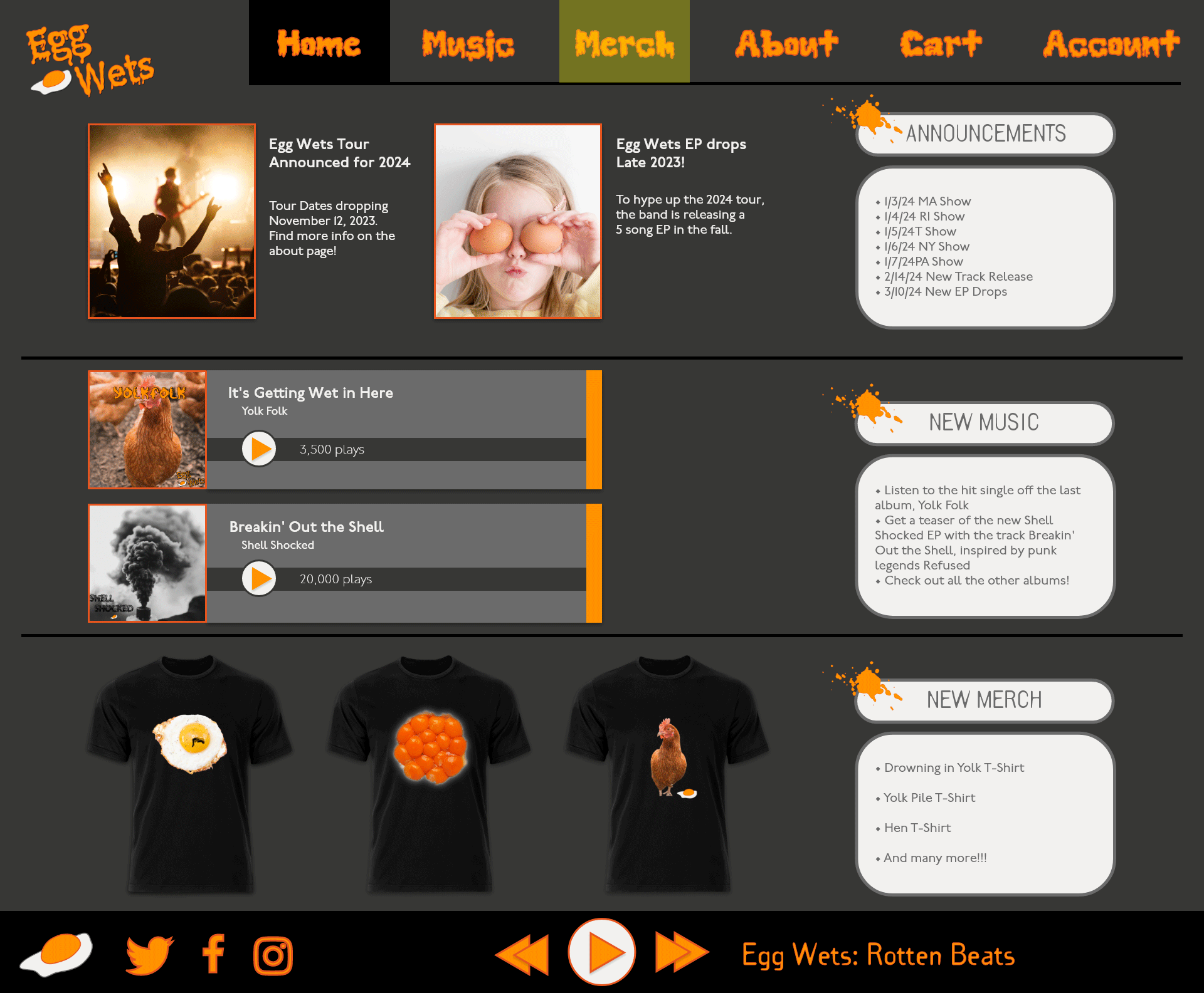
The Problem: The target audience of the band Egg Wets needs a way to stream and buy music and merch directly from the band without using third-party sites, which often charge the artist a fee
The Goal: Design a responsive website that will allow users to interact directly with the band's content and purchase music and merch from them without having to attend a show or use a third-party site
The Product: Responsive website for the band Egg Wets, allowing users to access the band's content through their phone, tablet, or computer
My Contributions
I was the primary UX researcher and designer on this project, which was completed for the Google UX Design Professional Certificate.
The final design for the Egg Wets Responsive Website can be tested here.

User Research
To better understand the target Egg Wets audience, I conducted interviews to identify their needs and challenges, using this insight to create empathy maps and personas. The primary concern for users was finding a convenient way to support the band without the physical need to attend a show. The existing platforms that allow this often impose fees on the profits the artists would receive, or restrict music streaming to radio shuffling, leading to user frustration and preventing a meaningful connection with the music.
Empathy Map
• Deleted their Spotify accounts
• Will not pay for youtube music

• "I hate using a middle-man to listen to the music that I like, the artist only gets a cut of my money, and most sites don't have the bands I'm looking for anyway"
Says
• "It sucks having to wait for a show to buy new music"
• Excited about local bands
Thinks
• Passionate about music
• Annoyed with media streaming services
Does
• Only buys music on Bandcamp Fridays
• Buys music directly from the artists at shows
• Doesn't want their money to go to some corporation that didn't create the music
Feels
• Annoyed, disappointed
• Wants to support the artists
User Pain Points
• Limited Accessibility
Fans, particularly disabled individuals, face the challenge of physically attending live shows, limiting their ability to support the band
• Costly Intermediaries
Existing platforms impose fees on merch and music sales, reducing the band's profits and making it more expensive for users to support them
• Streaming Limitations
Many platforms restrict music streaming to radio shuffling, preventing fans from enjoying the full experience of the band's music
• Lack of Direct Contact
Users may struggle to establish direct connection with the band for potential collaborations or bookings
Persona: Melodie
Age: 22
Education: High School Diploma
Hometown: Providence, RI
Family: Single, has roommates
Occupation: Content creator
"I want to buy music directly from the band, so they get the full amount from my purchase."
Goals
• Support musicians directly and not through a streaming service
• Be able to choose the songs they want to listen to
Frustrations
• Streaming sites taking a cut of the proceeds
• Some streaming sites won't let users choose songs; they only offer shuffle play or radio stations
Melodie is a 22 year old content creator based out of Providence, RI. They often ask permission from local bands to use their music in some of the videos that they produce. However, not every band has a website where you can pay them directly for their music, and streaming services just don't cut it.
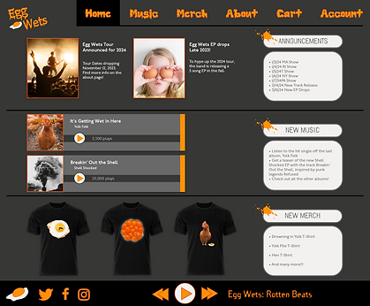
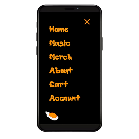
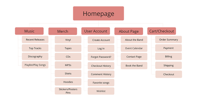
Site Map and Wireframes
Difficulty supporting the band directly was a repeat pain point for users, so I made that the main focus of the site map and wireframes. My intentions were to emphasize the Egg Wets' merch as well as music streaming, increasing ease of access to the band's materials.
Usability Study
Parameters
Study Type: Remotely moderated usability study
Location: United States, remote
Participants: 4 participants
Length: 10-15 minutes per session
Findings
1
Streamline Merch
Purchase Process
Users encountered issues with the purchase process for merch and music, indicating a need for simplification and enhanced usability
2
Digital Music
Marketplace Integration
Feedback revealed user intereset in acquiring albums and individuals tracks through digital means
3
Cart Page
Quantity Capability
Users expressed a desire for the ability to adjust item quantities directly on the cart page, underscoring the need for a more user-friendly experience
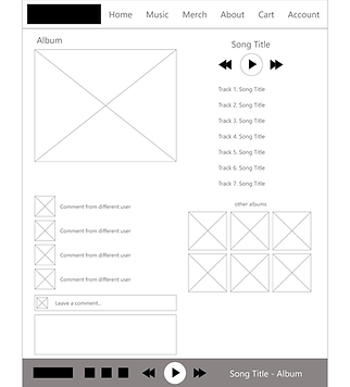
High-Fidelity Mockups


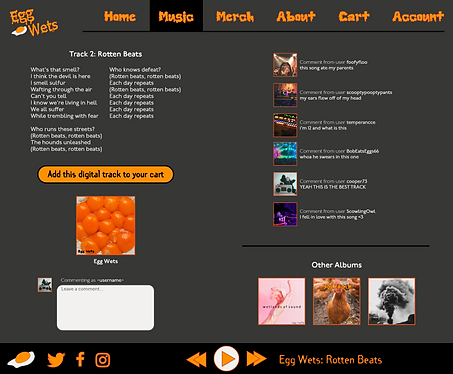
Updated User Flow:
Merchandise
Takeaways
Impact
During the last usability test of the Egg Wets website prototype, users had a much easier time interacting with and navigating within the site. They were able to access the band's materials and support them directly in a way that was still meaningful to them.
What I learned
While designing the Egg Wets responsive website, I learned more about designing for accessibility, including following WEBAIM standards and creating annotations for digital mockups. I was able to incorporate accessibility into my designs in a way that still matched the style and aesthetic of the band.
Updated User Flow:
Music